Question 1;In what ways does your media product use, develop or challenge forms and conventions of real media products?
Short films are known for containing some of the most inventive and unconventional story lines, to be found in film making. Although short films differentiate from a 'film', due to usually being made by amateur directors and being under 40minutes, they still share the same common conventions. To show this i will be reviewing some short films that i have either previously reviewed or that have caught my eye during the ancillary tasks and planning of our short film. i will be covering the five key concepts, which include;
- Narrative
- Genre
- Characterization
- Mise En Scene
- Editing/Post Producation
Narrative organization;
Due to the time length of short films, narratives are usually based around one or two characters, otherwise it may over complicate the story line and take up valuable time, instead short films tend to focus on a main life event, for example one of the films i have researched previously; 'Signs'.
To begin we are thrown into the main characters life, starting with a birds eye view, looking down on the main character in bed. Throughout the whole of the film, we watch him in his current life, this means we have no idea what has happened before hand and what will happen after the film has finished, therefore the short film is a main life event. This is similar to our short, as we began with a shot of Jenifer in bed, shot in the present, once again not knowing what has happened previously in her life or after, showing a life event.


Our ending is also similar to signs as both films are left with an open ending that keep the audience wondering. In signs we see the two main characters meet, but we are left wondering what will happen next. Moreover in our short ends on Jenifer finding out her dad was in fact father Christmas the audience will then be left thinking, what will the parents say.
Our narrative structure is in chronological order, however includes one flash back. We used the flash back as a reminder to the audience that Jenifer had seen the key prop. To make sure our audience knew it was a flash back we altered the colors to differentiate from the rest of the shots.

In most short, and full length films a common feature is a twist in the narrative. Usually the narrative will follow a straight forward path to set the scene of an ordinary life. As short films have a limited time span this can make the film more interesting, in comparison to a full length film that have plenty of time to set the scene and build enigma. Within our short film the twist was towards the end when we see father christmas kiss the mum, we didnt have much time to do our twist as we spent the majority on our film setting the scene.To begin we are thrown into the main characters life, starting with a birds eye view, looking down on the main character in bed. Throughout the whole of the film, we watch him in his current life, this means we have no idea what has happened before hand and what will happen after the film has finished, therefore the short film is a main life event. This is similar to our short, as we began with a shot of Jenifer in bed, shot in the present, once again not knowing what has happened previously in her life or after, showing a life event.


Our ending is also similar to signs as both films are left with an open ending that keep the audience wondering. In signs we see the two main characters meet, but we are left wondering what will happen next. Moreover in our short ends on Jenifer finding out her dad was in fact father Christmas the audience will then be left thinking, what will the parents say.
Our narrative structure is in chronological order, however includes one flash back. We used the flash back as a reminder to the audience that Jenifer had seen the key prop. To make sure our audience knew it was a flash back we altered the colors to differentiate from the rest of the shots.

Genre;
The catigorisation of genres within short films can prove quite difficult due to the categories not being fixed and in some cases they may belong to more than one genre. Genres are defined and separated on the basis of common characteristics, style of content, codes and conventions. Another way of defining a short film is Iconography, the idea of symbolic and repeated props that help define a genre, for example, in the short film 'mixtape' the two main characters are a boy and a girl, this is symbolic as this suggest romance, this is also the case with 'signs' as we relate to the social realism.
- Rick Altman developed the theory of 'Semantic and synthetic' approach. this means finding common narrative features for a genre, including typical plot development.
- Films that are classed as more than one genre are usually called a hybrid. This creates an interesting media text.
Mise En Scene;
Mise en scene throughout short films are very important when wanting to portray a certain image, for example social realism. During our film we were representing a family environment, to do so effectively we used a family home as our setting, similar to 'the black hole', they used the setting of an office.
Another part of mise en scene is costume, we dressed the young girl Jenifer in a pink cardigan, this is because it is something that a girl her age would wear, and bellow we also see an example of this in the short mixtape also.


Camera Work;

 we used many camera techniques throughout our film, just like any other short film, as they are used to portray characteristics, for instance we used a high angle looking down on Jenifer when she is in bed, we do this to show her emotions, to make her look smaller.overall camerawork is great at portraying emotions and showing empathy, making the audience feel her emotions is important due to the lack of dialogue in our film we rely upon the camera work and soundtrack. There is a similar shot to this featured in 'signs', shot from a birds eye view, looking down on the main character, this is a strong shot as we straight away get a feel for the main characters characteristics.
Editing/Post Production&sound;
 A common technique which we used in our film is to have non or little diegetic sound and instead portray emotions through camerawork and non diegetic soundtracks.once again 'signs' is a good example as there is no dialogue. I believe this is more common in short films as there isnt enough time to develop characters and often can give away the short story line.we conformed to these conventions.
The most intriguing short film i found to do with editing/post production work is 'the black hole'.this film relied heavily upon editing, as the black hole acted as a gateway. we however did not use this much editing however we did have to take multiple shots for each scene and then digitally stitched the together using final cut pro, it was time consuming however after a while we began to get to know the program more and managed to do it quicker and easier.
Characterization;
Characterization within short films can sometimes get lost due to the lack of dialogue. instead we are left to make our own judgement on the character.i believe this is more intriguing for the audience as they make their own narrative.
Themes and Issues;
The main theme raised was the whole father christmas myth that every parent tells their child. this allows parents to relate and children over the age of 11 to relate as we have all been told the story of father christmas. All comes down to the social realism of the film that we tried to create.
Ancillary Tasks
Poster;

- Title; The title is the largest piece of text on the whole poster, it is made to stand out so most people will recognized the film name and remember it. we made it stand out by putting in a bold larger font than the rest of the writing on the page. The white on the image background stands out, it also gives a christmas feel to the poster as you can relate it to snow. We also used the same font that is featured in the film to make a link.
- Image; The image consists of the three main characters, Jenifer, the mum and dad. This is implied by the costume and body language. The shot is a medium close up, this allows us to see the surroundings and the key props that show it is christmas. We are also able to see jenifers facial expression which does not look pleased, this hints to the audience, along side with the name of the title that something is wrong.
- The actors names are also a convention of a film poster, hence why we have made them stand out in bold. This is not as big in short film posters as you will rarely have a hollywood star featuring in a short film, however we have still done it for recognition purposes.
- BILLING BLOCK; we also made a billing block that we placed at the bottom, this includes production companies, cast and crew members and funding logos. these feature on all film posters to show people who was involved in the making of the film.
- the last convention are quotes from reviewers. these were placed on to the poster to show the audience what trusted companies have fedback about our film.
Conventions of a movie poster

- FILM NAME; bold, strong title that can clearly be read for passers by.
- A good IMAGE that features characters and setting, or reflecting the film in some way.
- ACTORS NAME, may make audience want to go see the film if a specific actor is featuring in it, therefore promotes the film.
- a TAG LINE, this is used to give the audience an insight to the story, also may include a quote from the film.
- DATE released so that people know when they can see it.
- cast and crew are featured in the billing block
- all of the above are usually all for big budget film posters.
Review;

Above is a print screen of how our actual review looks like.
.jpg) LWLs review page are always the same, with the same font and template all the way down to font size, dimensions and alignment.
LWLs review page are always the same, with the same font and template all the way down to font size, dimensions and alignment.From the example of the Brighton Rock addition i have reviewed the layout.
- Firstly the picture is a screen shot taken from the film that is being reviewed, like most of the layout this is consistent in each review.
- Secondly the title of the film, ' Brighton Rocks' in this case, is centered and in bold, Below the title are the directors and the main actors that featured in the film.
- Thirdly is the copy. To start the copy each addition has a capital letter, in bold that is usually 3 lines deep, this gives a professional appearance to fit its target audience. The review itself is around 500-550 word long and is split into 3 columns the third ending half way down.
- Lastly the rating system, marked out of five,this is to give the audience an idea of what the film is like from LWLies perspective.

Another component i found intriguing was the digital issue of Brighton Rocks. Similar to the printed addition the same print screen is used, the ratings are still featured, the only difference is the layout of the copy
Question 2;How effective is the combination of you main product and you ancillary tasks?

Question 3;What have you learnt from your audience feedback?
Audience feedback throughout the whole of the making and planning of our short film has been very important when it comes to making a definite decision, whether it be the poster ideas, the film or the review. It is essential that the feedback comes from a wide range of ages and different genders to receive balanced evidence, it is also important as these are the representatives of our target audience.
For the majority of gathering our audience feedback we used social networking sites, such as Facebook. Using Facebook allowed us to ask a wider range of people, from the age of 15+ and ask them on their thoughts of our finished short.

Feedback from the finished film;
Using Facebook I posted the video asking people to watch and comment their opinions, I also listed topics they could feedback on. In response to the post we received a fair amount of good and bad feedback.
What this gathered feedback has told me is that they all understood the story line and plot and thought it was creative and included a socially realistic narrative that they thoroughly enjoyed.
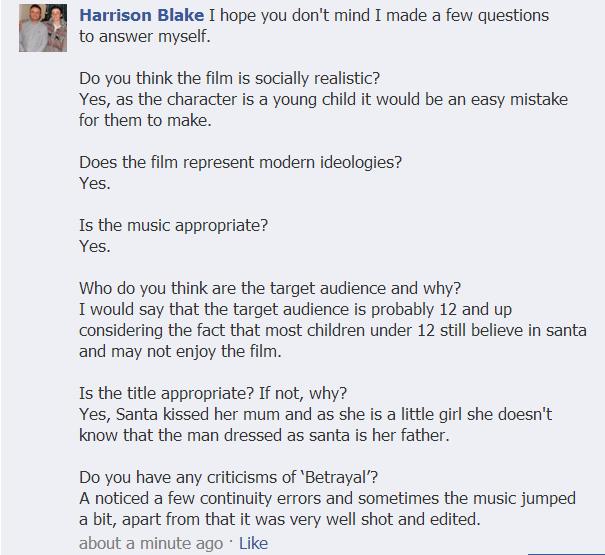 I have also learnt that the music in our film needs to be looked at in greater detail as many of the comments picked up on the soundtrack having glitches at certain points. However, feedback has also told me that they thought our music was a strong factor of our film that helped set the tone and mood of our film and helped communicate the thoughts and feelings of our characters.
There was also a lot of praise about camera work. We are chuffed with that comment as that is an important technique as you want your film to flow smoothly so that the viewer can get into the film.

Feedback for poster;
From the initial stages of planning for our poster we began by asking for feedback from people aged in our demographic. After lots of thought i drew out two examples of posters, we then asked our target audience and put into a tally chart. This helped up gather some idea of what our poster image should consist of.


- Child's Facial expression- could be a plot reference.
- Should include all characters, showing body language.
- should include Christmas color and more of a Christmas feel.

In comparison to the last audience feedback Karen also likes the image and that it includes the whole family, moreover she believes there is a Christmas feel to the poster.
Feedback of review;
For our review there wasnt much feedback that could have got off of our audience, as it was more to do with the language and the all together writing. Therefore we were able to write a draft version of our review and then allow our supervisor to look over our review and annotate. From this feedback we were able to correct any mistakes that we had made and over looked.


Overall our audience feedback that was gathered from a variety of ages and gender, was very helpful towards our ancillary tasks and not only helped us with our planning but our finished outcome.
All 4 questions done - well done!
ReplyDelete