In what ways does your media product use, develop or challenge forms and conventions of real media products?
Short films are thought of as some of the most inventive and creative work within the film industry, ranging from around 2 to 30 minutes long. Although short films do not often follow the same rules as feature length films, they have a set of common conventions of their own.
- Narrative Organisation
- Camera work
- Characterisation
- Mise en Scene
- Genre Conventions
Narrative Organisation
Through my research I have found out that as short films only run for around 2 to 30 minutes, they often only deal with one main issue or focus on one main event in the narrative. I think this is to keep it uncomplicated, and to make the simple story line as interesting and engaging as possible, rather than attempt to fit a complex narrative into such a short amount of time.


Screen grabs from 'Sprocket' and my own film 'Betrayal'.
- For example, 'Sprocket' (one of the films I have previously researched) has a linear structured narrative. All events take place in chronological order, and the narrative starts at the beginning of the plot and ends at the close. I think that this is because 'Sprocket' is only 2 minutes and 22 seconds long, and therefore the plot must be clear; I feel that a complicated narrative would disrupt the flow of the film.
- In my own film, 'Betrayal', we took note of what our research told us and adopted a similar styled linear narrative. All events in our narrative happen in chronological order, even though they are spaced out over different days. All the events that feature in our film are set out over the days leading up to Christmas, however as all the days our in the correct order our narrative organisation is still linear.
- We are thrown right into the main event; the narrative begins with three characters who we have had no introduction to, and nothing about their personal stories are revealed to us throughout the film.
- We did not feel the need to explain to our audience the three characters own stories as it was not key to our film. You can tell that they are a family and roughly the girls age. All the information that is needed to understand the narrative, is expressed within the film. As we were limited to creating a film only five minutes long, I felt that it would be unnecessary and a waste of time to give background information of our few characters.
- Todorov's narrative theory can often be applied to short films due to their linear narrative as previously discussed. I would apply the theory to 'Sprocket' in this way: Equilibrium- at the start or the film, three young boys messing around playing dares. Disruption- the two boys give the other a really scary dare that he doesn't seem comfortable with, going into the world of 'sprocket'. Confrontation- the boy meets sprocket a he explores. Resolution Sprocket is not in fact scary like they thought. New equilibrium- they boy tricks the other two and then they all run home.
- I believe that Todorov's theory can also be applied to my own film 'Betrayal'. Equilibrium everyone getting ready for Christmas, doing things together as a family, all is normal. Disruption- Jennifer runs downstairs in the night, and see's her mother and father Christmas exchanging gifts and a kiss. Confrontation- Jennifer is moody with her family throughout the new few days, including Christmas day, until finally she is confronted with the watch again and realises her father was the man she saw. New equilibrium- although not much of the new equilibrium is actually shown in the film, she now knows and everything can go back to normal.
- I also feel that Levi-Strauss' theory could be applied to my film, in terms of binary oppositions. In 'betrayal', in an unconventional way I think that our male character, the father, plays both binary oppositions at different stages of our narrative. For example he starts of being good, as all is normal, however when Jennifer see's her mother kissing father Christmas, he becomes the evil character. However, she does not know that it is her father, therefore he sort of plays two different characters within one role. However when she realises, he goes back to being good again.
- This also relates to Propp's theory, as the father character plays more than one of Propp's character roles, swapping from the hero to the villain, back to hero again.
- Although our narrative is an example of a linear structure we did feature a flashback. However, conventionally, flashbacks in short films refer back to a scene that is not involved in the narrative, it tells you a different part of the story However our film unconventionally flashed back to a scene already shown earlier in the film to remind the audience of that particular key moment.
Mise En Scene
A lot of short films are examples of social realist films, and often a lot of the 'realism' is created through the use of mise en scene. Use of setting, props and even costume are all strong tools in creating a feeling of social realism.
This convention is something that we wanted to portray in our own film.

Screen grabs from 'About a Girl'
- As you can see in the about screen grabs, the setting and props suggest a social realist setting. The cafe for example is a typical location that we would expect to see in real life. In this short, the mise en scene features are also used in order to communicate certain things about the character. For example these two screen grabs suggest that the characters are most probably working class.

- As you can see from the screen grabs taken from my own film 'Betrayal', we have followed the convention of choosing a realistic location that suits our film, therefore emphasising the social realist themes of our film. We chose to film in a house that suited the traditional elements for our narrative, and I think this location worked well and added a 'homely' feel to our film.

an example of our location
- However our film was based around the theme of Christmas, therefore we needed some more specialized props. We had to bring in a Christmas tree, decorations and even roast dinners. It was important that we went the extra mile with these aspects of our mise en scene as they were key to the plot of our film.

- 'About a girl' also features really realistic and simple costumes, once again adding to the realistic themes. I think that this is done in order to suggest certain things about the characters, such as social class and background. Short films often use mise en scene features to suggest things about the characters, as they are so short and therefore do not want to take up time in the narrative.
- We let Jennifer pick her own outfits out for our shoots, as I felt that if she was wearing something she chose herself, it would be as accurate as possible as to what children of her own age wear. Obviously we also had her dressed in pajamas and snow gear. I wanted Jenifer to dress as a normal young girl would as it is important to keep all the costumes as realistic as possible.
- As we had to use teenage actors to portray our parent characters (due to our low budget), we had to ensure that their costumes helped to convey them as adults. We dressed them in fairly plain clothes, typical of what parents would wear around the house. We did not want to communicate anything about their own stories through the outfits, simply trying to ensure that our audience understood that they were the parents.

Genre Conventions
Short films are often an example of cross-genre, as they are so experimental and alternative they often resist being put into only one genre category, and sometimes sub-genres are created. Some cannot be put in to any at all.
Our film is an example of this, it resists being put into a genre category.
'About a girl' is also an example of this. Alike my own film, it cannot really be placed into a genre category. However both 'About a girl' and 'Betrayal' are examples of social realist films, and I feel that this is becoming a genre in itself.
Because of our films resistance to genres, it is hard for it to be compared to a genre theory. I have attempted to apply a range of theories to my film however I have found this really hard. I have found that Steve Neale's theory of repetition and difference could be applied, in the sense that the repetition would be all of our Christmas aspects, the traditional aspects and the family activities together, this is typical of Christmas films and is commonly portrayed in the way we have shown it. However the difference would be the slight twist to our narrative, something a lot less traditional and a bit darker, as a child finds out that Father Christmas is not real. This slight twist is not something that you would typically expect to see in a Christmas film.
Here is a clip from 'About A Girl'.
Camera Work
Camera work is a really important tool in expressing certain things about your character and representing them how you want them to be seen.. A common convention of short films is to use camera techniques to portray the character in a certain way, influencing how the audience see them; this could be in order to make the character seem like the 'goody' or the 'baddie', or to make the narrative more effective.


- For example in 'mixtape', we are introduced to the young boy character in a close up shot of him looking just below the camera. Instantly we can tell the characters age, gender and we can also see some facial expression. As we being to understand what the boy is doing, there are a number of close up shots shown in order to communicate with the audience how he is feeling, and allowing them to empathise with him.
- We used this technique throughout our film. As we had minimal dialouge throughout our short film, we used close up shots expressing facial expression and body language to communicate to the audience what wasn't being said in words. Through these shots, the audience were able to understand how our characters were feeling and how our plot was developing. I think that this was a really good convention to follow, as mininmal dialouge is very common in short films, and using different camera techniques to show our characters made our shots more varied, detailed and interesting.
- Alike 'mixtape', our second shot is a close-up of jenifer, with her eyes level to the camera, in this particular shot she looks excitable and happy. This communicated to our audience her excitment for chirstmas day, and introduces our main character as a chirpy young girl. (see screen grab above)

- Another common convetions of short films, when discussing camera work, is the use of close ups to signify certain props as important, or key to the narrative. 'Mixtape' does this a few times throughout, one exmaple being the big-close up shot of the mixtape itself. This is really key to the narrative and to the spectator, as it reveals what the title of the film is about, and begins to suggest certain plot structures. As shown in the screen grabs above.
- We followed this convetion in our film 'betrayal'. Our plot is based around one significant prop, the watch, however the audience would not neccasarily know this. Therefore it was really important to the inderstanding of our film that we made that particualr prop really stand out. By doing this, we had a big close-up shot of the watch when it first appeared in our film. To create even more of an emphasis, we dragged the clip out a little bit longer. This is shown in the screen grabs above.
Characterisation:
Characterisation is really important as it is a way of constructing how the characters are percived and represented. It establishes the audiences view of each character, right from the start of the narrative.
This is shown in 'The most beautiful man in the world'.

- As you can see in the above screen grabs, the young girl character is portrayed as alone, vunerable and deprived. This is dhown through close up shots of her unwashed and emotional face, and long shots of the dirty room she is sleeping in. Instantly, the audience see the young girl, and empathise with her. She is represented as a victim, and the audience are encouraged to feel sorry for her and want to reach out to her character. The audience are also therefore encouraged to dislike the mother character, and see her as the 'baddie', before they have even met her character; this view is based purley on what the audience have seen of the young girl.
- This is very common of short films, to create a representation of one character, purley on the representaion of another.
- The childs character is represented as helpless, and therefore it causes the audinece to want to fill the role of her 'helper'.

I think that this shot is particually effective for characterisation, as she appears so small in the frame making her look really alone and vunerable.
- In our own film, 'Betrayal', we have portrayed the young girl as cheerful and happy, showing her excitment for chirstmas. As our film is an example of social realsim, it was important that we kept jenifers character accurate to a real young girl of her age. This was fairly easy, as jenifer is obviously not a real actress, therefore as she is so young she didnt really get into character as such, we more just told her to act as herselft but in the situations we put her in. This was succeseful, as now her charcter's images is accuarate, creating a realistic characterisation.


- We portrayed the parents as typical adults, bonding with their child over the chirstmas season.
Our Film Poster
Film posters are created in order to attract and audince, and advertise the film. They must be enaging, in order to create a hype and draw in an audience. Through my research I have found that film posters, both feature length and short, have a set of common convetions that always appear, no matter what the film. Obiouvoly each poster is adapated and designed differently to suit the particular film.
Some common conventions of film posters being:
- Titling
- Key Image
- Billing Block
- Cast Names
- Critical Accalims
- Film Website
- Film Festival Logos
- Sponsors
Here are some images of film posters, both short films and feature length films:

Here is my own poster:

I attempted to convey all the above convetions, in order to make my poster as proffesional as possible.
Title-
Through my research I found that it was imporatant for the titling to be the largest text on the page, more specificly it should be around 1/3rd of the whole poster. I attemptted to confrom to this by making my title large on the page, in dark bold writing. I felt that this text stood out, and definatley created a focus as the main writing on the page. The title is also an important feature as it gives the audience a clue as to what the film may be about.

My titling
Actors names-

I found, that the bigger the actors, the bigger their names will be on the poster. This makes logical sense too, as if you were a huge Johnny Depp fan, and you saw his name written in large on the front of a new film poster, you'd want to go and watch it simply because of the actor, and therefore it is important that his name is shown in large. However, if the actors are less well-known, then it becomes less important. This is the case for us, as we are a low-budget film company we cannot afford to hire well-known actors. Although the acting in our film was very good, they are new to the acting scene and therefore would not draw in much of an audience themselves. This simply means that for my own film poster, I felt that the actors names did not need to be very large on the page.
Key Image-
I think that every poster I looked at, had one key image of one of/the main character. The image may also include some key setting or location, or even a prop. For example, the 'Brighton Rock' poster features a background of the pier, communicating the setting of the film, also supporting the title. However other posters, 'Juno' for example, take the key image and edit it onto a new, sometimes plain background. This can create more of a focus upon the characters if location is less important.

Billing Block-
The billing block is an aspect that is always featured on film posters. It is usually found at the bottom of the page in a dark or dull font, and is often hard to notice. It is a legal section that has to be printed, crediting the right people. Below is my own billing block, and some examples from real film posters.
Click here for a link to my blog post about my own billing block.

My Billing Block

Fishtank Billing Block
Critical Acclaims-
There are always some critial accalimes quoted onto film posters. It is important to get a quote from the right people, as it must communicate to your target audience that its a film they want to go and see.

On my poster, I quoted 'Little White Lies', as that linked in with our review. It is also important what quote you feature, as it must give off the right impression about the film. I had to remember when planning these aspects, that although they may not seem as important, it is stuff like this that the audinece read when looking at my poster, and therefore I must plan it to attract the right people.
Film Festival Logos-
 Esecially on short film posters, film festival logos often feature. I think that this is because they are a great way of getting your film out there to the public and therefore you want the festivals to be as popular as possible. It is all in order to get as much hype about your film as possible. Below you can see some examples taken off of real film posters, and the festival logo's that I featured on my own poster.
The review
We created a review in the style of 'Little White Lies' magazine. In order to make my review appear as realsitic as possible, I followed all the rules and convetions that I had researched. I followed the same layout structure, to the exact sizes of columns and pictures. Throughout the research and planning stages, I look at a number of little white lies reviews available at college, making notes on the language features used and the overall layout. More can be read about this in my previous blog post here.

Here is my final review.

Here is a print review taken from Little White Lies.
Conventions:

- Red boxes: These boxes indicate seperate paragraphs. The reviews tend to have roughly around 7 paragraphs and our around 550 words long. We made sure that we had a similar amount of paragraphs and stuck very closely to the word count.
- Blue Circle: The circle shows the 3 point rating system. Each review has it, and it rates the film out of 5, on 'Anticipation', 'Enjoyment' and ' In Retrospect'. We did this for our own film, giving it a 2, a 5 and a 5.
- Black Circle: The small black circle is highlighted the Little White Lies statement large letter. In every issue, the first letter of the review has a large letter, taking up roughly 3 lines. We copied the review in such detail, creating the large letter and making it the correct size.
- Pink Cirle: This circle is showing the film title, the direcor name, actors name and release date. If you look closely you can see that the words 'director' and 'actor' ect are in ittalic. The title is really large, similar to the poster, I feel that this is to create an emphasis.
- Green Box: This box whos the key image, suggesting something about the film.
Click here to read our review in full.
Question Three:
How effective is the combination of your main product and your ancillary tasks?
Question Two:
What have you learnt from your audience feedback?
Throughout the making of my advanced portfolio, audience feedback has probably been the most useful tool for making final decisions about my work. It has aided the whole group in all aspects of our portfolios, from the film, to the poster and even the review.
I made sure that my feedback was sourced from a variety of people, ranging from all age groups and both genders, but of course taking special notice to the comments of my target audience.
I gathered my feedback in a number of different ways:
- Social Networking
- Youtube
- Survey
- Interviews
- Teachers
Social networking sites such as 'facebook' and 'twitter' were the most common ways of me gaining feedback. As our target audience is ages 15 to 25, and this is the most common ages of Facebook users, it was a perfect way of getting people to tell me about my work!

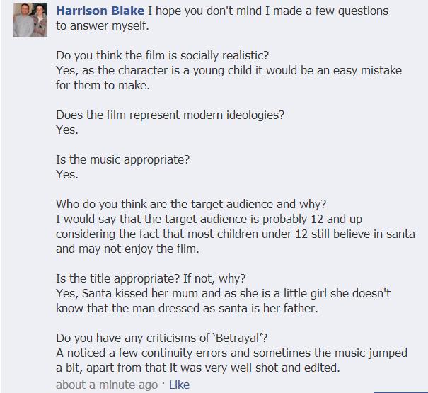
To the left is an screen shot of a post asking for feedback that myself and Ella posted onto Facebook.
We posted the video onto the site, asking for comments about our film. We also suggest a few things that people could comment on that would be useful to us.We got a really good response, everyone was really helpful with their feedback and it taught us a lot about our work.

Here are four images of feedback on our final film through facebook, all in our target audience demographic.
- A lot of the feedback we received was really positive, and it told me that people understood and enjoyed our plot, and liked our Christmas and social realism themes.
- However, audience feedback is most useful when it tells you what you need to improve on. Some of the comments highlighted some issues we may have with our soundtrack. People commented saying that it 'glitched'. This tells me that we will need to go back and listen to our track, and try to uncover the problem. If this problem is non-resolvable we will have to look for an alternative song, as it seems to be quite a serious issue. However, some comments did say that most of the time the music sounded good and added to the atmosphere of the film, which was really positive to hear.
- The comments on our camera work were really positive, so I do not think that we will be needing to edit that at all!

We have also been receiving feedback on YouTube This image highlights one particular comment, how many views we have had and how many likes our film has received.
For our very first stages of poster planning, Ella drew some images, and myself and her spent a long time getting as much feedback as possible. These two images below were our final choices, and up to a very late stage of creating our poster, they were our two final choices to be photographed.

The original two drawings.
We gained feedback for our poster in a number of ways, below is just one example of this. We did a survey on the two images, asking people what one they preferred and why.

Although the table may look simple, I found this feedback really helpful. It told me what picture was more effective and therefore what image we should focus on photographing. Also, the feedback is from a ranged audience which is really good, as our film as quite a wide target audience and we wanted to hear what a number of people had to say.
We found out what people felt that our poster should include, such things as:
- Facial expression (suggests plot)
- Christmas factors
- Child as main focus
Although we did not end up using these images, we did stick to the factors that our audience told us to include.
Review Feedback
Unfortunately I was unable to get audience feedback for our review due to lack of time! However, our supervisor did make some annotations and comments on our work, which as a group we found very useful!

How did you use new media technologies in the construction, and research, planning and evaluation stages?


.jpg)


